The visual arts have been using symmetry for a long time. For something to be symmetrical, it needs to be comprised of two halves, which are mirrored by each other. In order to create a balanced look, some aspects of symmetry must usually be used. This gives a stable look, which looks organized, neat, and pleases the eye. However, many websites are made using asymmetrical designs. With these designs the two halves are not the same.
The majority of sites will try to use balance, and have a logo to the upper left, with something else on the right, like a menu. Columns of content are often symmetrical to each other, and other aspects of a page.
The use of symmetry is not something that is new to the internet. However, it is a very popular technique to use if you want a balanced looking page. If your page uses symmetry effectively, it should give a bigger feeling of balance, while making the page flow more smoothly from one side to the other. Following are some examples of website, with descriptions of how they use symmetry.
Pixel Bleed
![]()
This site might appear confusing to some designers, because it does not follow the usual rules. At the bottom of the page, you will find the navigation and logo. This is not something, which usually happens on the majority of pages, where these features are located towards the top. However, it still works fairly well and makes the page seem unique. Symmetry is definitely used in the design of this site, with everything located towards the centre. There is a lot of empty space at the top of the page, but the heavy amount of visuals at the bottom seems to balance this.
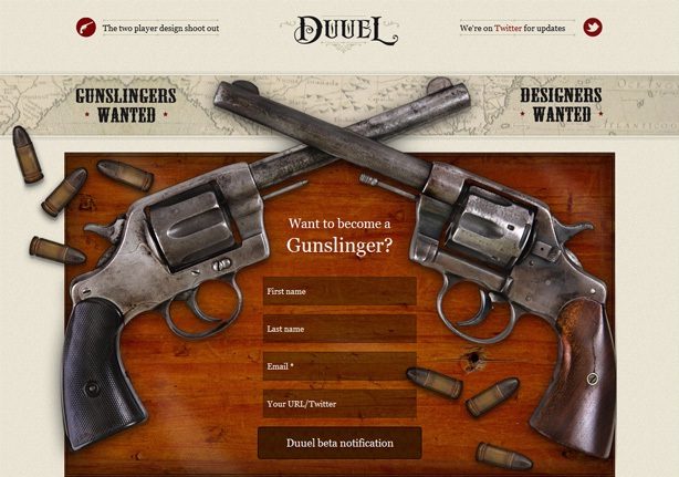
This website has pistols located on each side of the screen, which cross barrels in the centre. This helps to portray the feeling of duelling between designers. Each designer will be very skilled, and matched evenly, and the symmetry of the page helps to convey this.
This is a prime example of how you can give good vertical flow to a site, by the use of symmetry. This site guides users through all of the content, rather than just offering everything up in a seemingly random order. The idea behind this website is to deliver a sales pitch by encouraging users to move along, one step at a time.
Clocks
If your web page is not going to have a lot of content, symmetry might be a good technique to use. The people who made this website did not have to add a lot of information, as their product mostly explains itself. Adding anything more would simply add clutter to an otherwise stylish page.
Symmetry helps to draw focus to a certain aspect of a website. The designer has drawn attention to the owner’s name, which is a useful sales strategy. The site can remain relatively simplistic, because the symmetry does most of the work.
No related posts.
Related posts brought to you by Yet Another Related Posts Plugin.


Leave Your Response