Ever since the first websites were made, the hyperlink has been a staple in their design. If you were not able to link from one page to the next, the internet would not be the same. If you have ever been reading an article, and found an interesting link to another related article, you know how useful the hyperlink can really be. Using links is what makes the web work, and without them you would find it very difficult to access new pages.
It makes sense that we should put a lot of effort into creating effective links and navigation systems, right? If your website has poor linking and bad navigation, people are most likely going to be tired of it and navigate away to another page. Do not let your competition steal your visitors just because you have not implemented a good navigation system. Even if your website has the best content out there, you will need to have your links in the right places, leading to the right things if you are going to entice people to stay on your website.
Because website designers are working with a computerized medium, they are not limited in what they can do. That is one of the greatest things about the internet. However, the navigation for many sites seems to have become stagnant and boring, simply following the trends of the past.
If you are making a small site, such as for a small business, many people will use a horizontal navigation bar across the top of the pages. This works well, but it is not very inventive. However, if you are getting a lot of traffic to your site and you do not see the sense in making changes, perhaps this article is not for you.
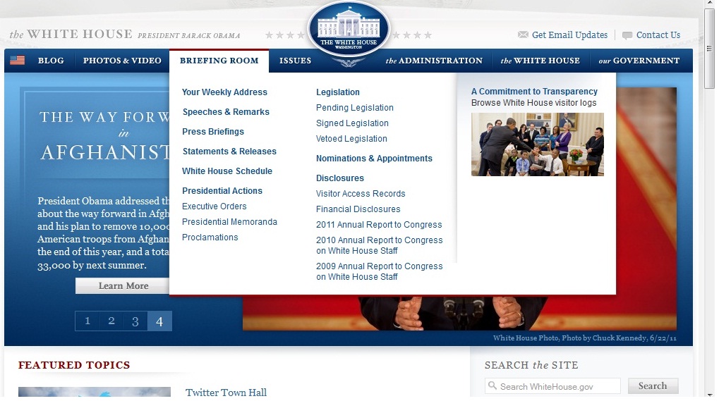
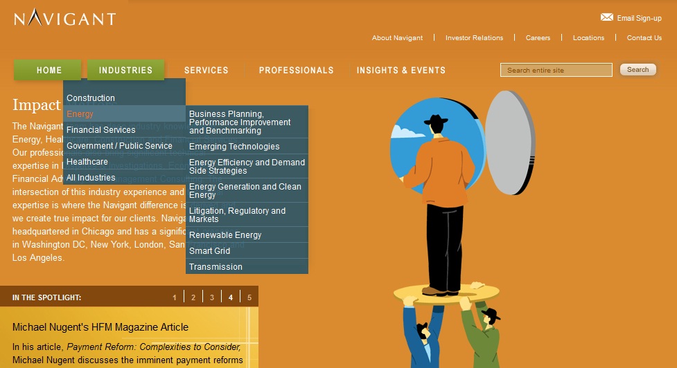
Bigger sites, which have to deal with more pages, tend to have vertical navigation bars, because they allow the designer to include more links on the page. Drop down menus are very popular these days, with sites using similar things such as fly out menus in order to store their navigation links.
Early website design limited people in how they could display their navigation links. Today people simply follow that tradition and use what has always worked. Many people are just used to these types of navigation design, and do not question their use. However, some people are starting to become tired of seeing the same old thing on every single website that they visit. People are yearning for a change, and there has to be someone to give it to them.
The internet has always evolved very fast, ever since it was first created. Designs are becoming easier for users to deal with, and they are becoming more enjoyable to interact with. There are more features, and websites are more attractive than they have ever been. However, while everything else seems to be evolving, navigation seems to have stayed pretty much the same. It is up to designers to come up with new ways to rethink website navigation.
No related posts.
Related posts brought to you by Yet Another Related Posts Plugin.


Leave Your Response