If you have ever entered a store simply because they had a sign on their window that advertised a sale, then you understand the concept of call to action buttons. These buttons are like sale signs in a store, only for your website.
The most important thing to remember when you are using these buttons on your website is to make them colorful, use effective language, and place them in the proper places on your site.
Here are a few things to consider when adding these buttons to your site.
1. Effective Language
The choice of language that you use on these buttons is extremely important. Use words that your customers are familiar with such as buy, try it now, or download here. These words should be something that your consumers are already thinking about and the button simply gives them a place to do it.
2. Color, Size and Font
You want to choose a font that is easy to read on the site. Some of the best ones for this are Helvetica, Arial, or Tahoma, which are all Sans Serif typefaces. Ideally, you will want to make the call to action button large, but if you need it to be a bit smaller, you can still make it stand out by using colors that contrast on your page.
3. Positioning
To make your call to action buttons the most effective, you want to make sure they are placed properly on your page. Most website developers tend to keep the call to action buttons strictly on the homepage. However, you really should consider putting these buttons on every page of your website. Just make sure to keep them relevant.
4. Inspiration
There are plenty of websites out there that you can view to get some inspiration when you are designing your own call to action buttons. Here are a few names of sites that you can view to help get you started.
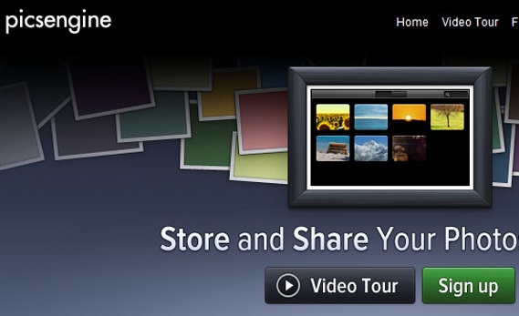
PicsEngine, uses two call to action buttons, a video tour button and sign up button. The sign up button is emphasized using a contrasting color.
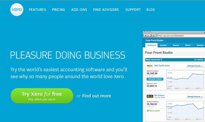
Xero uses great colors and places the call to action button directly under a text that makes visitors curious about the product.
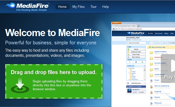
Medifire does a great job of strategically placing their call to action buttons. The very first item a visitor will see is the “Upload to Medifire” button.
LifeTreeCreative uses a call to action button effectively by making it larger than even the logo. It is definitely the most visible thing on the site.
Perhaps the ultimate site that uses their buttons the most effectively is Google. There is a reason that the site remains the number one search engine used.
Summary
Here are a few things that you need to remember:
• Make the button direct by using only 1 to 4 words
• Make the button as large as possible while keeping it professional looking
• Use contrasting colors
• Use texts that draw the visitor to the button, but do not let it get cluttered
• Position the button in a place where it draws attention
Perhaps the most important thing to remember is that a call to action button is what brings customers to your site. The more they click on these buttons, the more profit you make. For this reason, they are not just buttons and need to be considered carefully.
No related posts.
Related posts brought to you by Yet Another Related Posts Plugin.






Leave Your Response