When creating poster and thinking which designs you should choose, keep in mind that you need to grab your readers’ attention in a few seconds. This will also be from quite a distance, so you have to be certain you have conveyed your message rapidly and effectively.
Here, are a few secrets to help you develop and create a poster that is both eye-catching and will effectively communicate your promotional message fast.

When you are developing the layout avoid any clutter, as people have to understand it instantly. The poster’s layout and design should allow the eye to flow smoothly in order to assimilate the information. Allow some areas for white space, to allow the eye to rest from other graphic elements on the poster, especially around the text. You will notice that it is more restful and attractive for your audience.
For the use of colors stick to bright ones, as these will grab the public’s attention. Make sure there is a lot of contrast, and use colors that go well together, allowing for clearly legible color for your text. You can use a color wheel to select your color scheme if you do not know how to choose your colors adequately. Learning how to use a color wheel can help you achieve better results.
Avoid the use of too many colors; otherwise your poster will confuse your readers. It is also important to choose a color that will appeal to the public you are targeting, for although it may grab people’s attention, the public you wish to impress, may not like the colors you are using.
When choosing how to write your text, it is essential you keep it short, with one main message. Try to make it clear cut and keep to the point, and place it in one section only. Avoid scattering the message around the whole surface area of the poster. The promotional message must be catchy, but not too subtle as people should be able to grasp the meaning instantly.
Stick to two fonts only for the text and the heading, and choose fonts that are clearly readable from far away, for the heading especially.
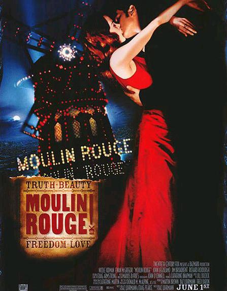
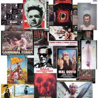
When designing the graphics, use one image, avoid placing five or six images around the poster, as this will confuse and irritate your audience. Choose one bold and clear design, which will be easily discernible from a distance. It is fundamental that the image relates to the text, as people usually view the image and then read the message.
Choose your image as a support for the message you are trying to convey. Avoid the overuse of graphic elements, such as shadows and backgrounds. If you are going to use these, do so only to enhance the image and text, these should not overshadow the main image and content.

Keep in mind that your poster will be large, so stick with images that will work well on a large scale. So remember that if you blow up a smaller image, the result will be a blurry mass that simply cannot work. You will have to work thinking big.
No related posts.
Related posts brought to you by Yet Another Related Posts Plugin.


Leave Your Response