All businesses and many private users have a website or blog nowadays that it is becoming difficult to stand out from the crowds of designs, styles and more. There are also many free hosting websites that provide a free and easy way for people to create a website without having to hire a web designer.
Fortunately, few people really know the secrets of how to design and submit a website online so that it will meet the wished for success. Although a website involves a large part of creative work, it is also a way to present a business to millions of users and there are certain rules that you must take into consideration if you want your work to be viewed on the web.
There are basic rules you cannot ignore if you want your website to have an impact on readers and be a success. Experience and talent to play an important role, but many ignore the basic steps you should take to create a good website.
Take some time to consider what makes a website attractive. Many use Flash to attract attention to their website, but this feature by itself will not make your website attractive. Another aspect to consider is that you do not have to be an impressive illustrator in order to create attractive web pages. What really counts in a web design is the way you organize the various elements in a page, as this will dictate how user-friendly and attractive the website is.
You should consider the following elements for your website and design to have an impact and look good on the web: balance, grid, color, typography, graphics, white space and connection.
The balance in a design will ensure that your design does not exceed in one way or the other as far as symmetry goes. You need to carefully check the layout of all the elements in your page as these elements tend to outweigh each other easily, especially as far as color and size or the addition and removal of other elements is concerned. It takes time and patience to achieve a good balance in a web page as all successful websites have well-balanced structures to their pages.
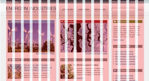
Grids go hand in hand with balance as these are a series of vertical and horizontal rules that will help you in the layout of your design. Columns help make the information on the page more accessible to readers, as spacing allows for easier reading. There is a general rule that you should follow, that defines the page should be divided into sections, in which the sidebars represent a third of the page’s width and the main content is contained takes up the rest of the page. The side bar is usually placed on the right and takes up half the space of the left column.
In general, although the design does not need to be visually impressive, it is important to structure the elements so that they render viewing the web pages easy and pleasant to the eye.
No related posts.
Related posts brought to you by Yet Another Related Posts Plugin.


Leave Your Response