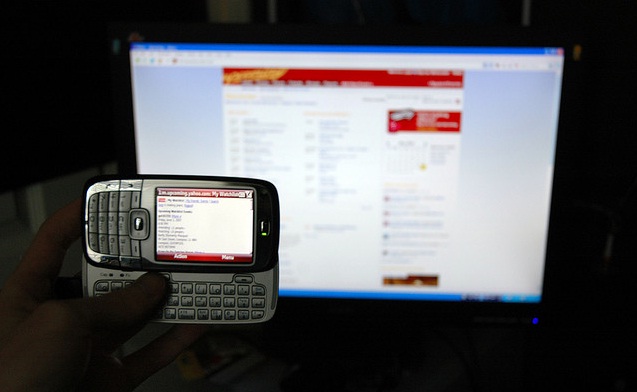
Nowadays web designers have to face the fact that mobile devices are starting to take over the more classic form of browsing the internet as many users prefer mobile devices over the common PCs. The complexity of mobile applications can be a real head-spinner for web designers who need to adapt not only the cross-browsing used in these devices but need to apply them to all the different types available on the market.
These devices support diverging platforms as well as having the option of using numerous different mobile web browsers, and it really becomes difficult for web designers to test and adapt to such a vast array of different applications, platforms and browsers.
 In addition to these issues, mobile web also pose other problems that have to be dealt with, such as a smaller screen and brand-width for connection, it is, therefore, not surprising web designers are having a hard time combine all these options for a satisfying result.
The first issue web designers and developers should tackle is to add mobile support to the website they are working on, as well as a specific stylesheet that will help modify the CSS and make it functional for mobile devices. Using a server-side option will allow the website to detect the type of mobile device redirecting it to a mobile sub-domain or will come up with the suitable stylesheet. This system provides an excellent way to guarantee an advanced level of compatibility allowing the website to serve different mobile users.
 What stylesheets are aiming to achieve is to create an effective layout for smaller screens. This means the stylesheets need to divide the page in a column layout to a single column layout. Taking into consideration that unlike PCs most mobile screens have a vertical layout, this is how stylesheet will work as these small screen cannot support horizontal layouts. The next step will be to reduce all unnecessary display elements that are not fundamental for the page setting, in order to shrink the layout.
Brand-width is another issue that needs to be taken care of by reducing it for slower networks on mobile devices. You will also need to make the background images smaller or even change them. On many sites, the navigation buttons have images on them, which will not work for mobile devices and must be changed to CSS with normal text.

All elements that use floating effect will not be displayed correctly on mobile devices, so it is best to get rid of these. Keep in mind that vertical layouts are much better than horizontal ones. Other elements that will not work are mouse-over states, as most mobile apps will not be able to read these. By applying definitions from both the active and hover states this will help mobile devices have a better display. When a user clicks on any item the pseudo-class will be displayed on all types of mobile apps. These techniques will only work to help mobile device users browse more smoothly, while other important elements should also be considered. Amongst these is the drop-down navigation, which should be substituted simply by offering links that will take users to the desired pages.
No related posts.
Related posts brought to you by Yet Another Related Posts Plugin.


Leave Your Response