It is amazing how many e-commerce websites ignore the importance of making a website challenging despite the fact, they know that this will boost sales and make their website unique. Most online businesses know that success lies in creating a challenging website, but they are simply not ambitious enough to make an effort and really challenge those mammoth websites such as Amazon or similar big names.

The most difficult issue when wanting to make a website truly challenging is the product page problem. These product pages are extremely complex to manipulate as they contain a variety of elements that can be hard to manage when designing the pages. It is true that other pages on e-commerce websites can generate sales; the product page still remains the stronger focal point of conversion rates.
It is surprising how most websites simply show the basic amount of information that is needed to generate a sale. This is not enough and needs to be revised if you want to boost sales. Keep in mind that potential customers like to spend the least time possible on a page, so making browsing and purchasing easier will generate more sales.

There are essential elements you need to integrate in your product page if you want to sell effectively. These cannot be left out when designing your e-commerce product page. If you omit these three fundamental elements you probably be lucky if you sell anything at all.
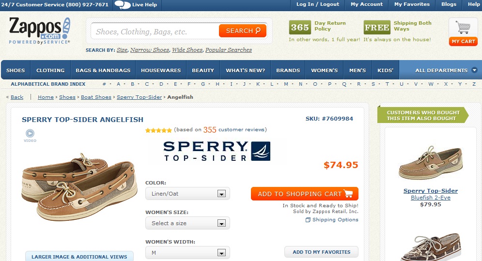
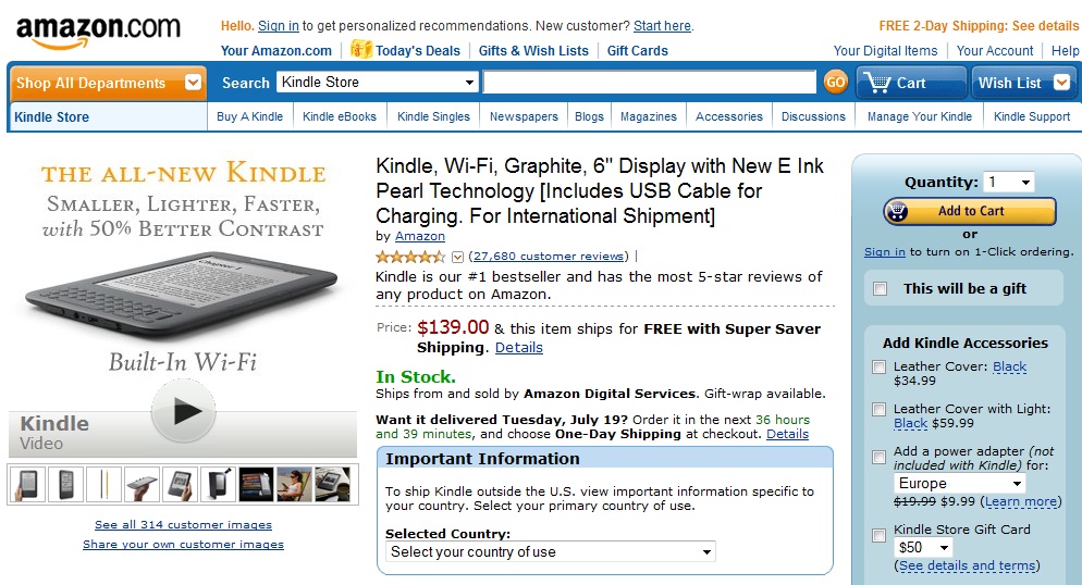
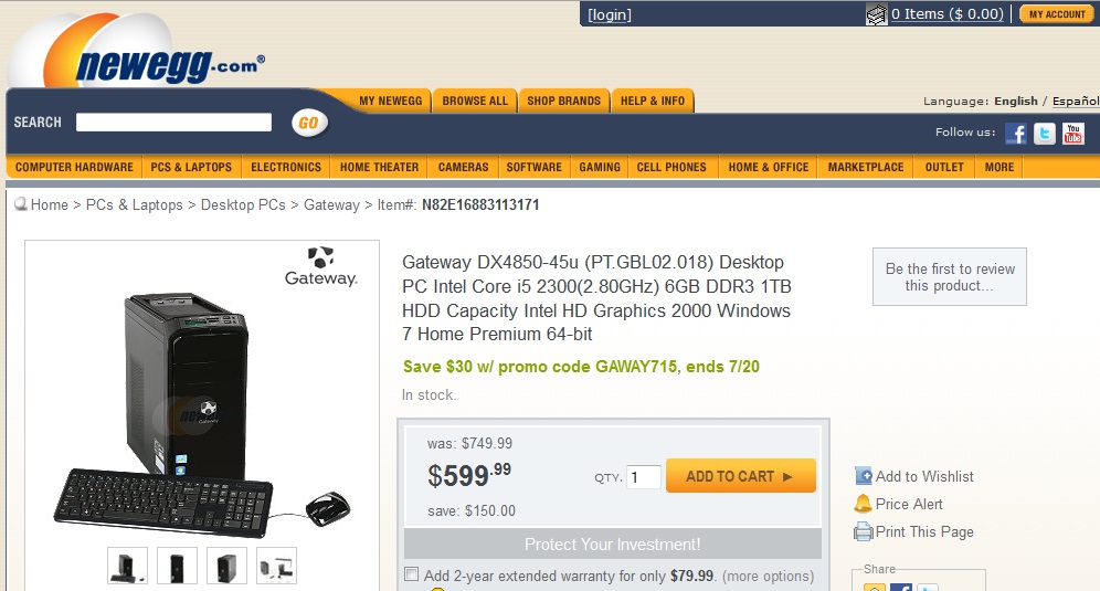
The product name is an obvious factor, which sometimes is overlooked. Visitors have to know what they are seeing on your website. Make sure the name of the product provides a clear description using short sentences with keywords, which readers would use to optimize search engine results. An example of a descriptive but short product name would be, 18ct Gold Earrings instead of Gold Earrings, as the former gives a more detailed description, which still remains succinct. It is important to provide a unique descriptive name for each product to differentiate it from the others.
The price tag is important and it should be clearly visible so that users can verify that. The price should stand out well on the product page and be visibly located next to the BUY button. The description should lead the reader directly to the price then on to the purchase button, in one fluid succession.

Once you have your reader’s attention, the next step is towards the actual purchase of the product. Whether or not the reader decides to buy your product lies in the dimension and color of the BUY button. This button is the key element for generating sales and should be designed to suit certain categories of users, depending on different variants that can be cultural, geographical or demographical.
It is best to place this button high up on the web page, ideally just above the fold. If your product is no longer in stock then the best solution is to use a message telling the user that it is out of stock or simply hide your purchase button.
No related posts.
Related posts brought to you by Yet Another Related Posts Plugin.


Leave Your Response