
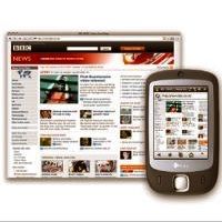
Mobile use has been taking a toll in recent time; in fact, the last decade has observed a striking increase in the consumption of mobile phones. It has practically become the first screen for every individual in the world now. Due to this heavy consumption, web developers were forced to think over points on how to grab this huge market. This is a very feasible and profitable market. They couldn’t have ignored the fact that people preferred mobile phones over computers and laptops and that, nations were looking forward to decreasing their data service charges just to satisfy mobile users.

Mobile development isn’t at all simple; there is a lot of complexity involved. The entire working has to be done cross-platform; the varying platforms have made it such. Unless the phones are working along browsers such as Opera Mini and , your site cannot be opened up easily and you need to make sure that you do wonders just to make it accessible by all.
Here’s how you should start working on giving your website the mobility.
Begin by embedding a stylesheet so as to adjust the CSS for mobile devices. The stylesheet detects the phone and directs the user to the mobile domain of the page. A very good example of this is when you type www.facebook.com from your mobile phone, you are immediately directed to m.facebook.com. This may seem the way out to all mobile development features but there is still a lot that stops the website from being displayed on your screen and you should be taking care of them.

Some sites have put up the option of mobile version or full version on their site. It’s up to the user if they want to take a mobile look or a full version look of the page. A very good example of this feature would be IKEA’s site.

To make it quite a forceful tool, make sure that your mobile website displays just the information you want to have displayed. Avoid embedding several columns and do not focus on the horizontal view of the phone, since that tends to add up cost. A tight layout of your content can help you save numerous pixels.
You should also try to reduce the bandwidth on which the websites open up. If your website takes too long to load then you might miss out on the opportunity of capturing the mobile audience.
Bring about other changes such as giving the option of font sizes. Some may be too large while some may be illegible; so give the people a choice to pick the one they’d like and view the website accordingly.

You could simply opt for another feature. For this, I’ll again refer to Facebook; embed in the SMS option from the website so that you’re frequently updated on your page. All that the user has to do is, set their carrier and put up their number. This enhances user experience and they can stay updated with your website whenever they want.
Mobile website is another whole world and you still haven’t capitalized on the thought then you’re missing out on a huge market.


No related posts.
Related posts brought to you by Yet Another Related Posts Plugin.
Leave Your Response